Occupied Staging
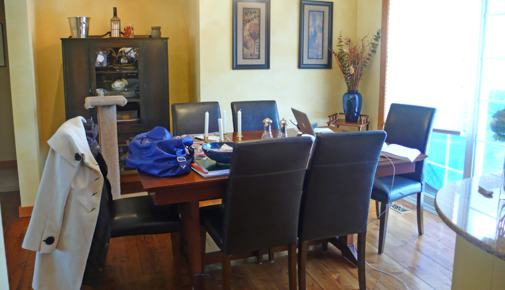
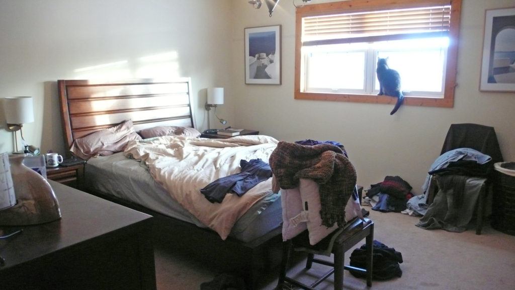
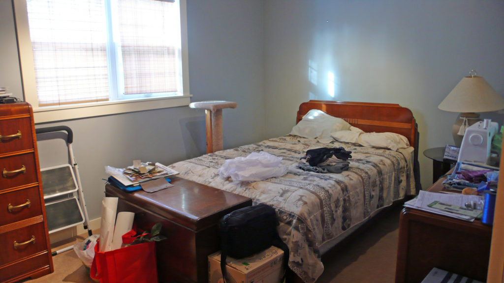
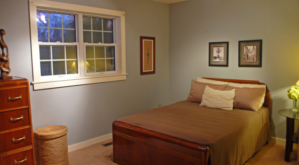
Before: In this home, the living room is rather crowded and the flow is somewhat restricted. The Dining room is untidy and the cabinet needs some styling. In the bedrooms there is too much visual information, so streamlining becomes a need.
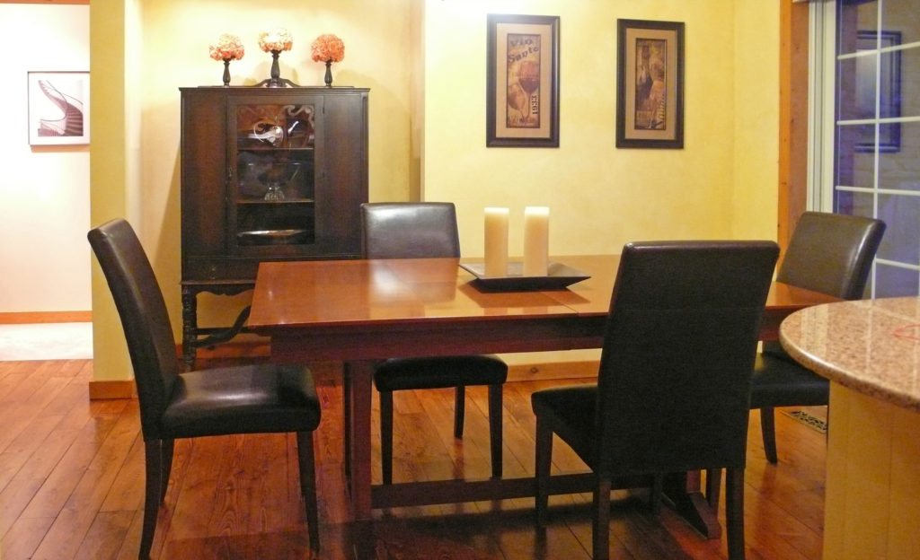
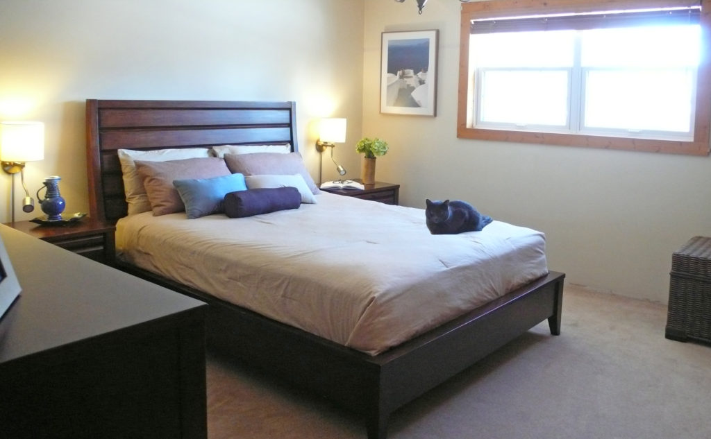
After: Using the homeowner's existing furniture and accessories, this home was styled to be bright, inviting and the architectural features were highlighted. Removing some of the furniture and fine-tuning the accessories improves the flow and composition.
Vacant Stagings
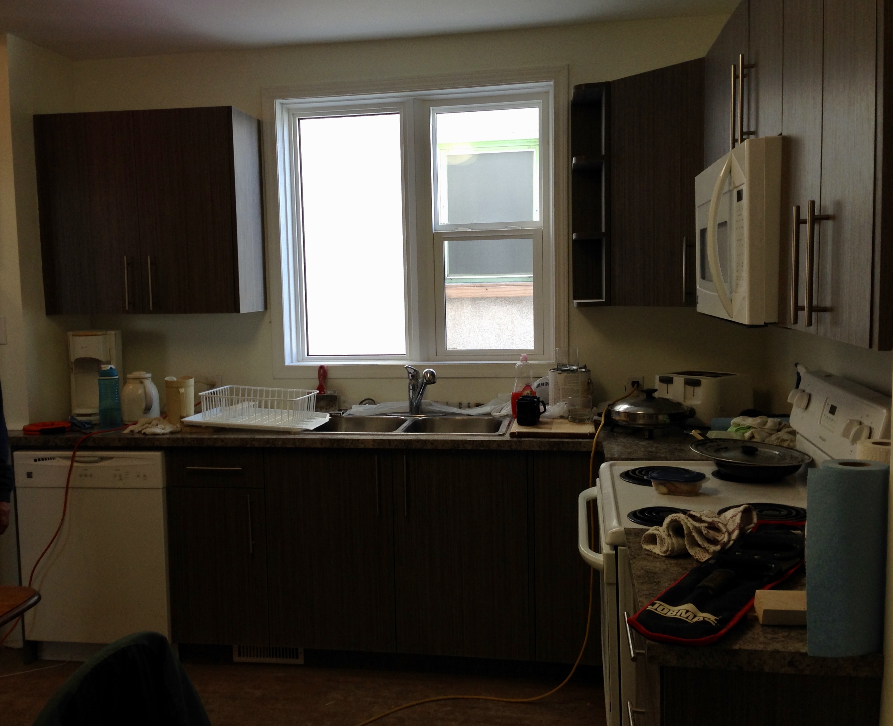
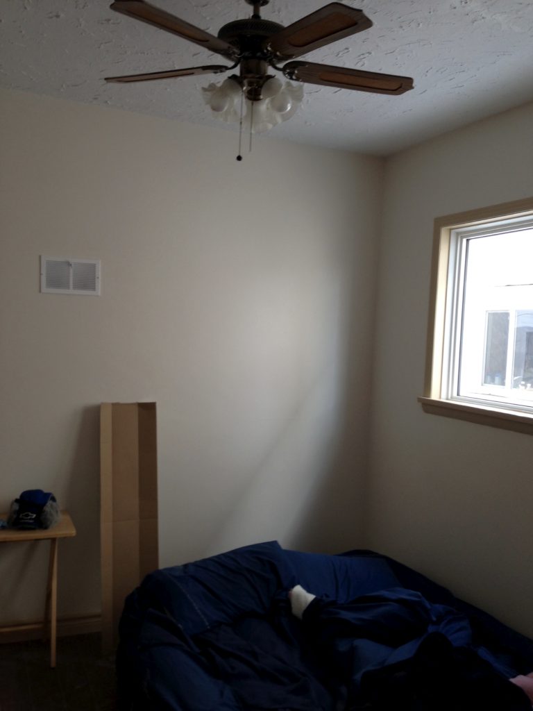
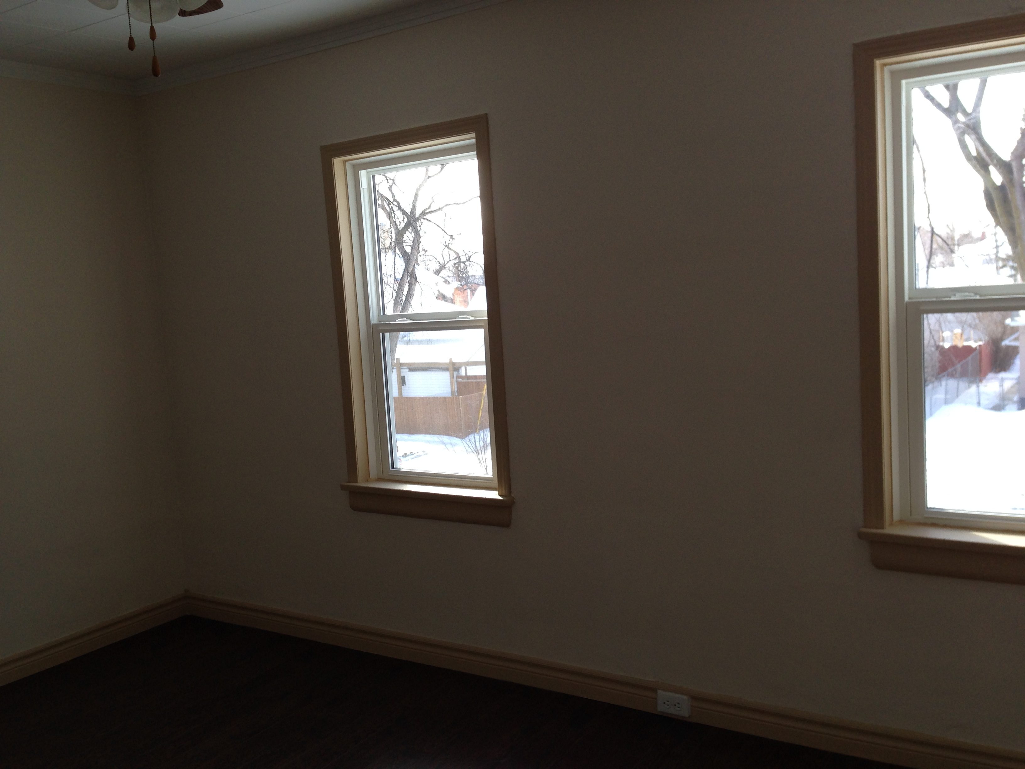
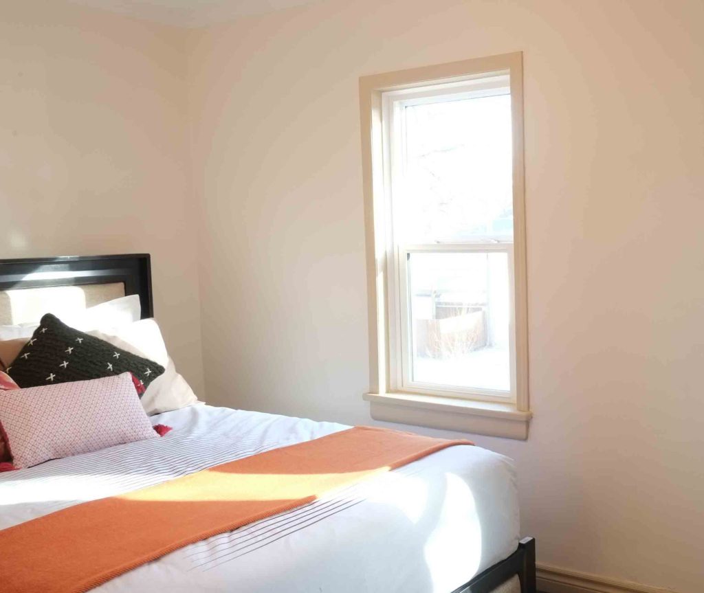
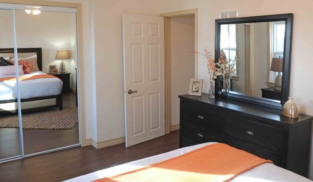
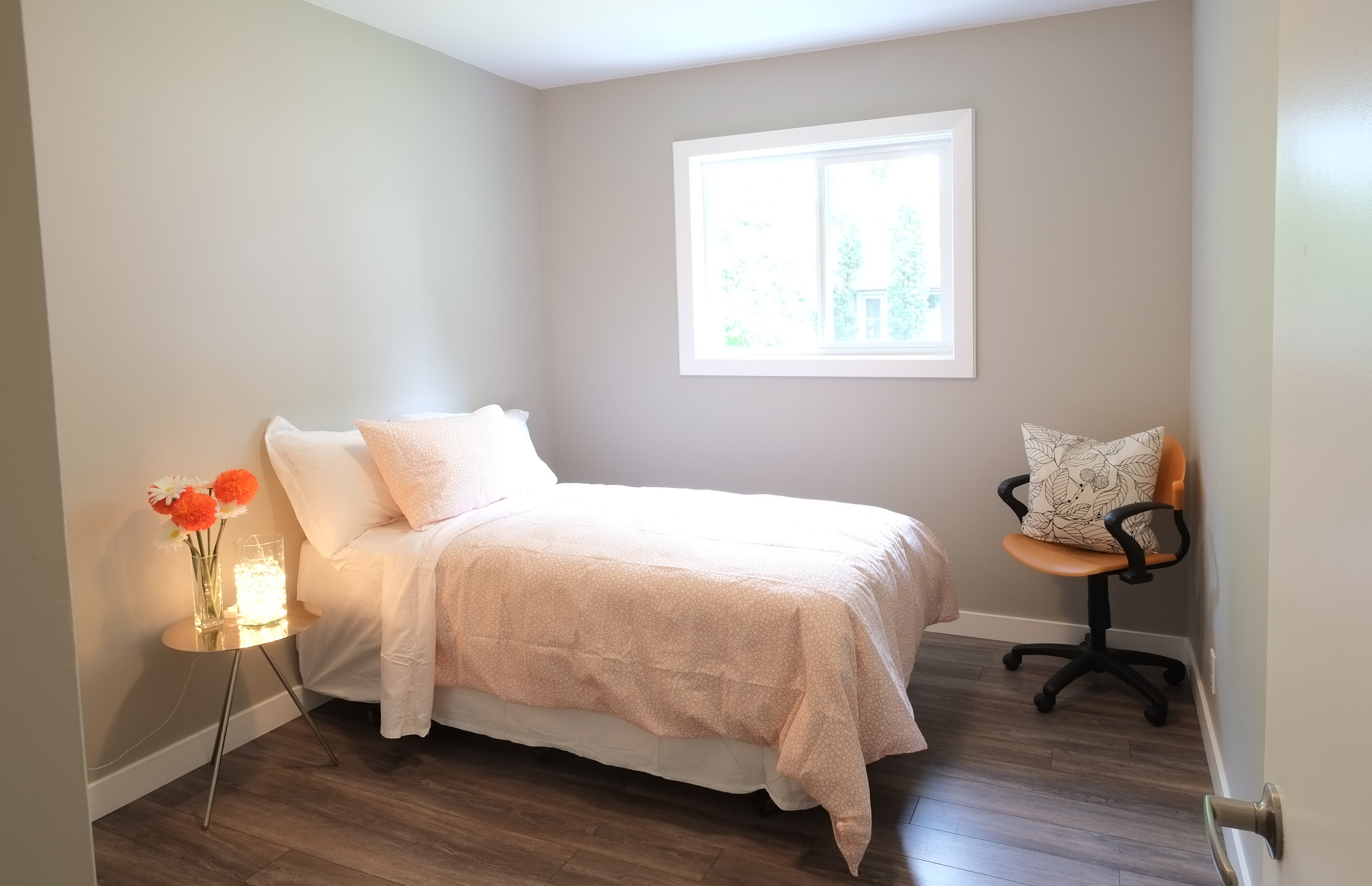
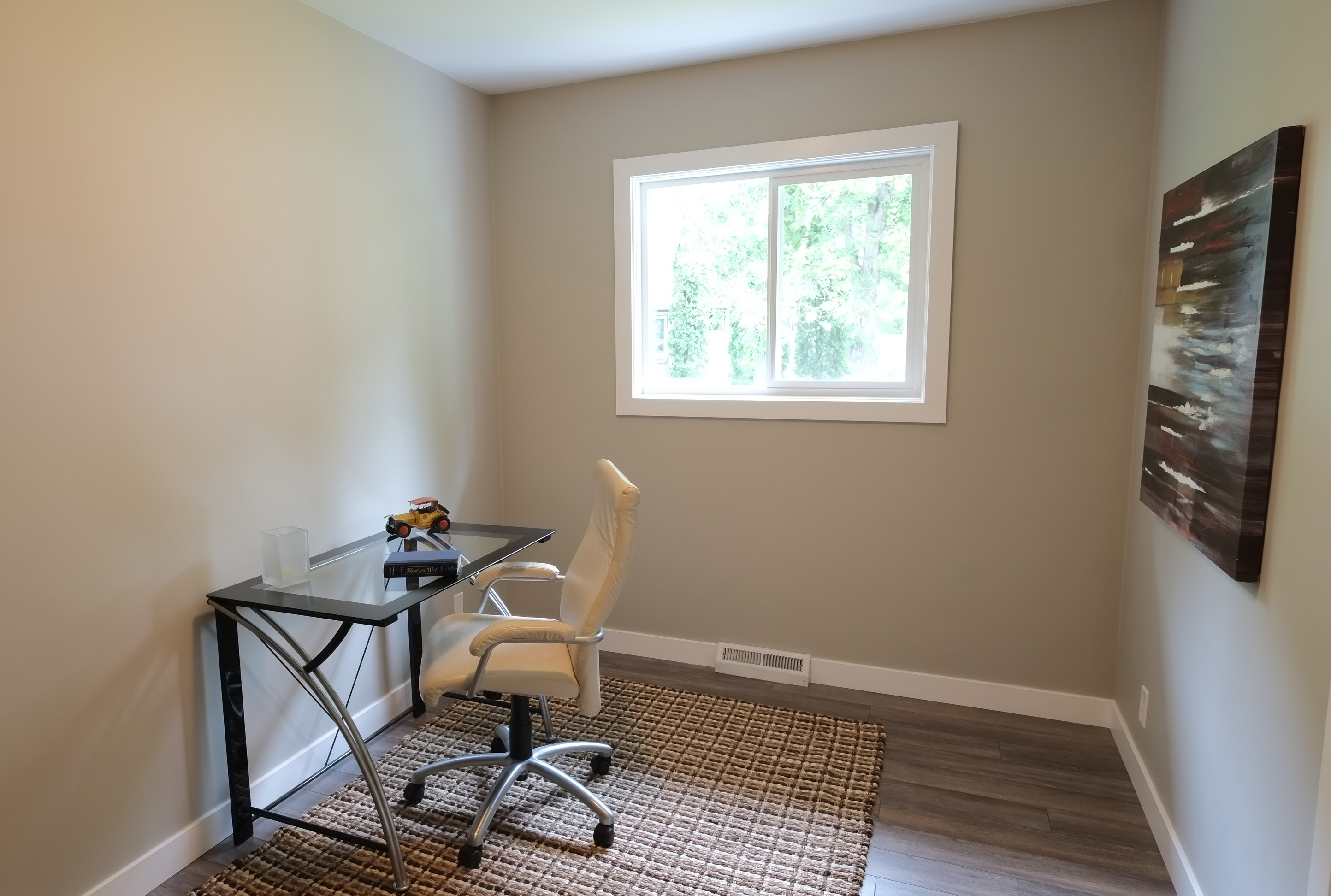
Before: This home was undergoing renovations and was completely unfurnished beforehand.
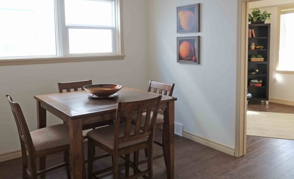
After: Following the removal of all the construction material, the home was thoroughly cleaned and then furniture was brought in to complement the space. Flow, features and function of rooms were all considered when the home was staged to appeal as much as possible to buyers.
Renovations
Suburban Transformation
This home had been left untouched for years. Most of its structure was original. The basement had never been finished.
To bring this great 3-bedroom home back to life, much work needed to be done. The entire exterior was painted, new windows and doors were installed. The shingles were replaced. The overgrown shrubs had to be trimmed and decommissioned. The front planter needed to be leveled. The lawn needed to be fertilized and weeds brought under control.
Inside, the mechanical systems were replaced. New furnace, hot water tank and air conditioning installed. A wall was removed to open up the space and allow for more natural light to. New floors, base and trim installed. All lighting and hardware were replaced. The entire home was repainted.
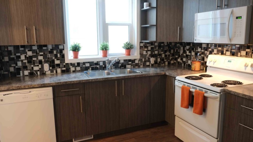
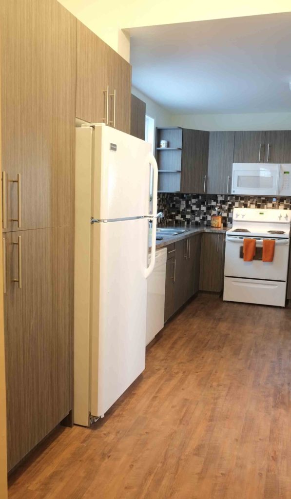
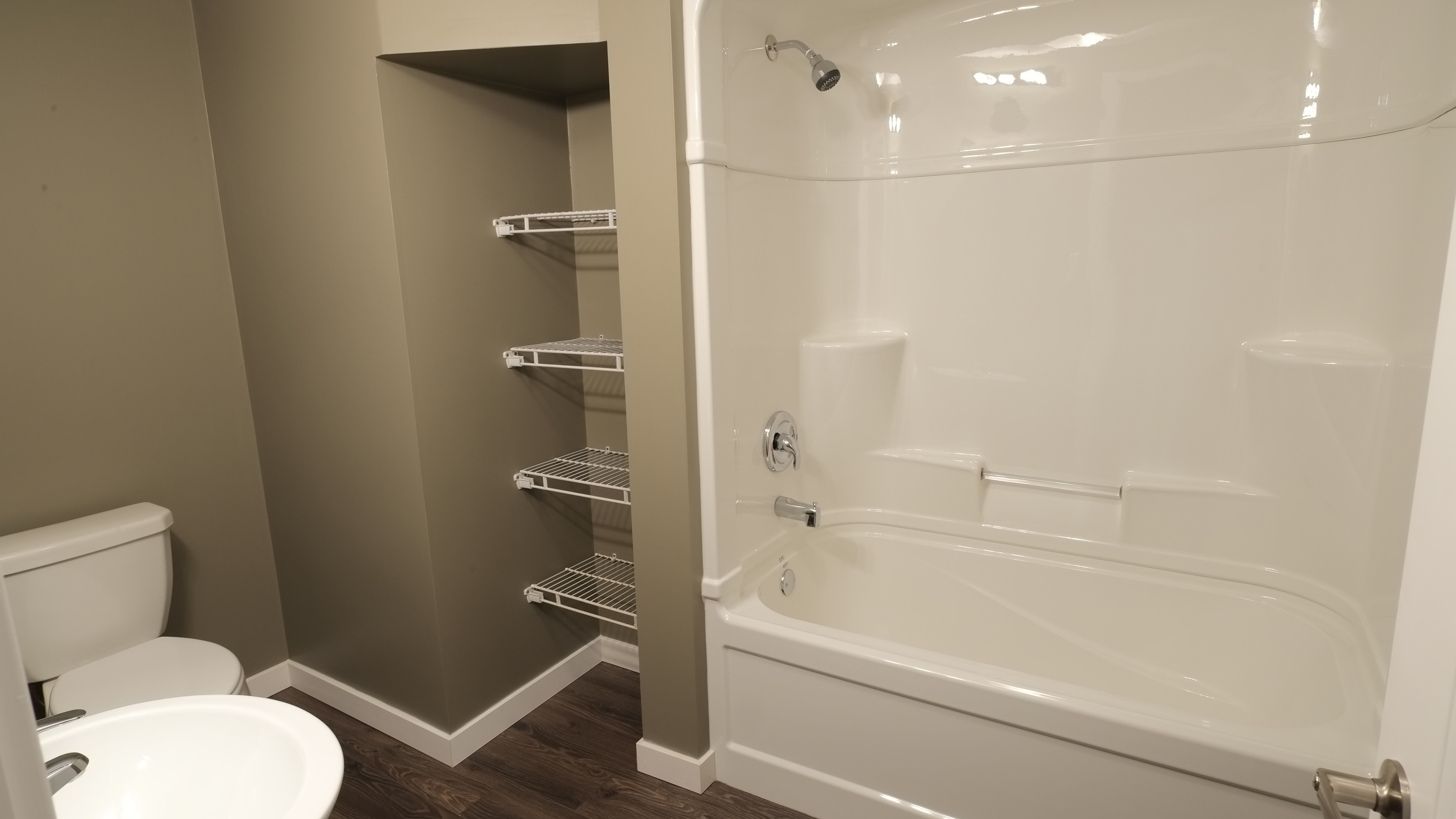
In the kitchen, new contemporary cabinets were installed, contributing with additional storage. The bath was also upgraded with new fixtures and a larger double sink vanity installed.
The lower level was finished out with an extra bedroom, laundry area, second bath and a large recreation room.
This home went from old and tired to new and revitalized.
Renovations
Kitchen Make Over
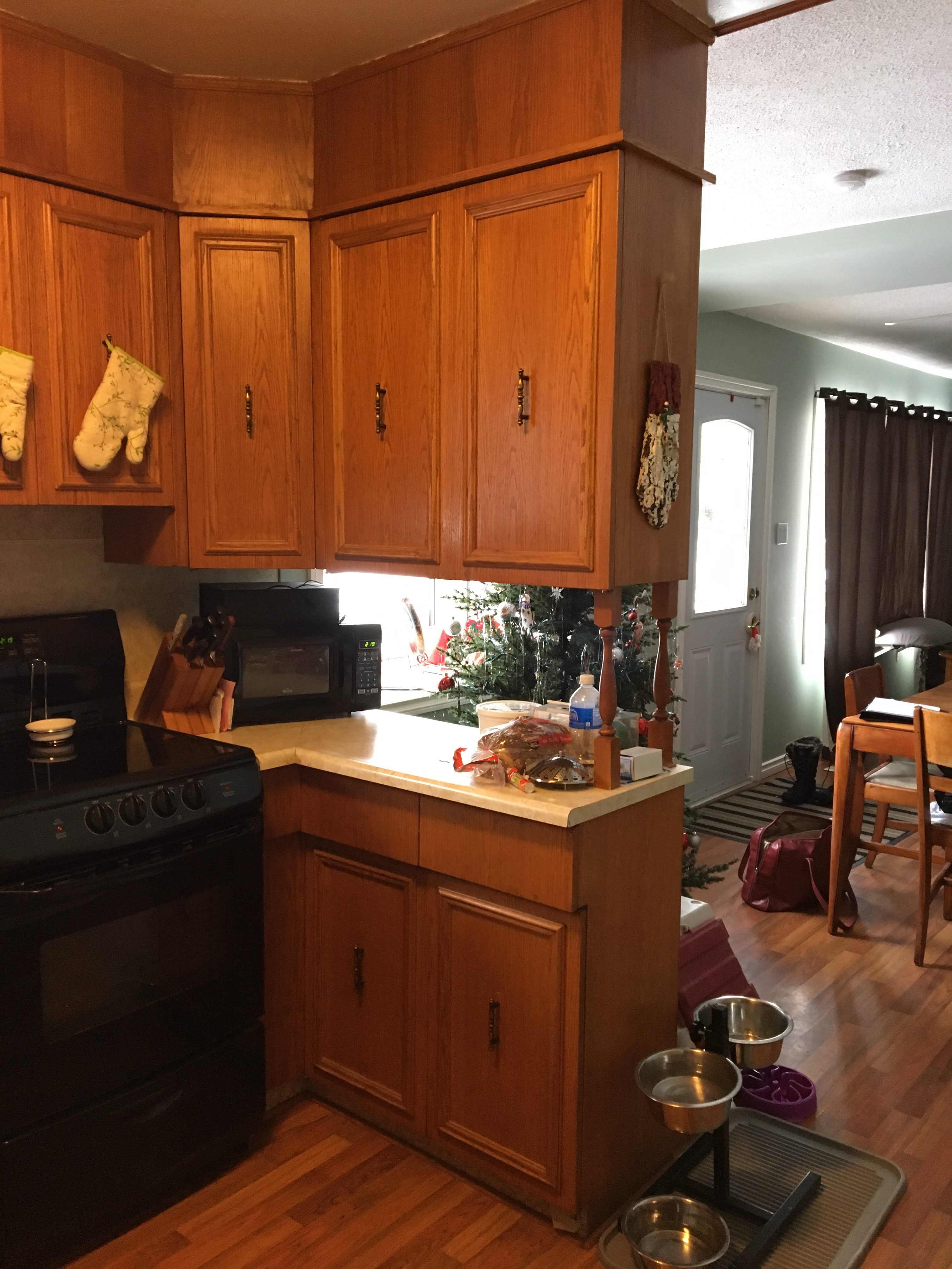
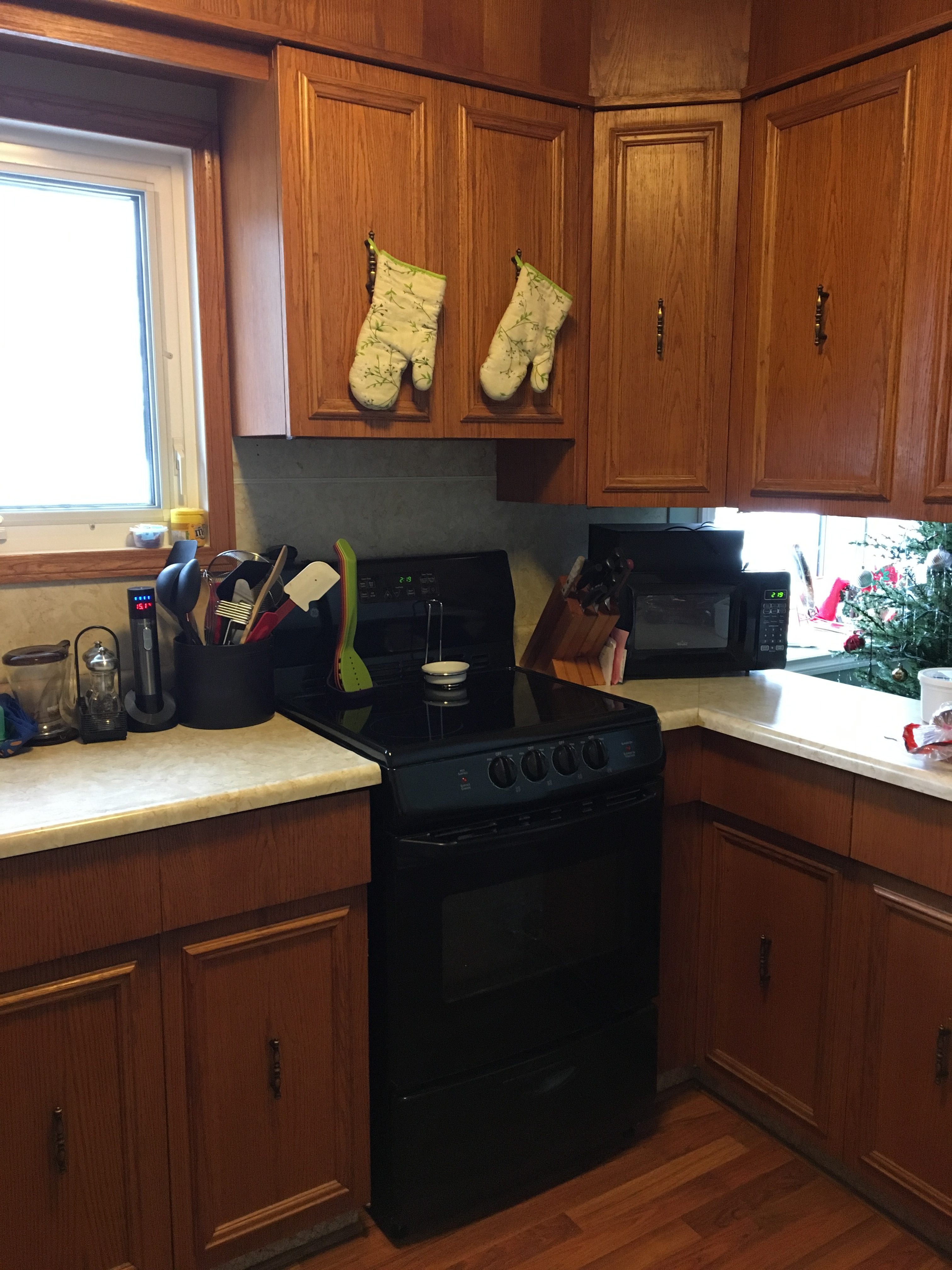
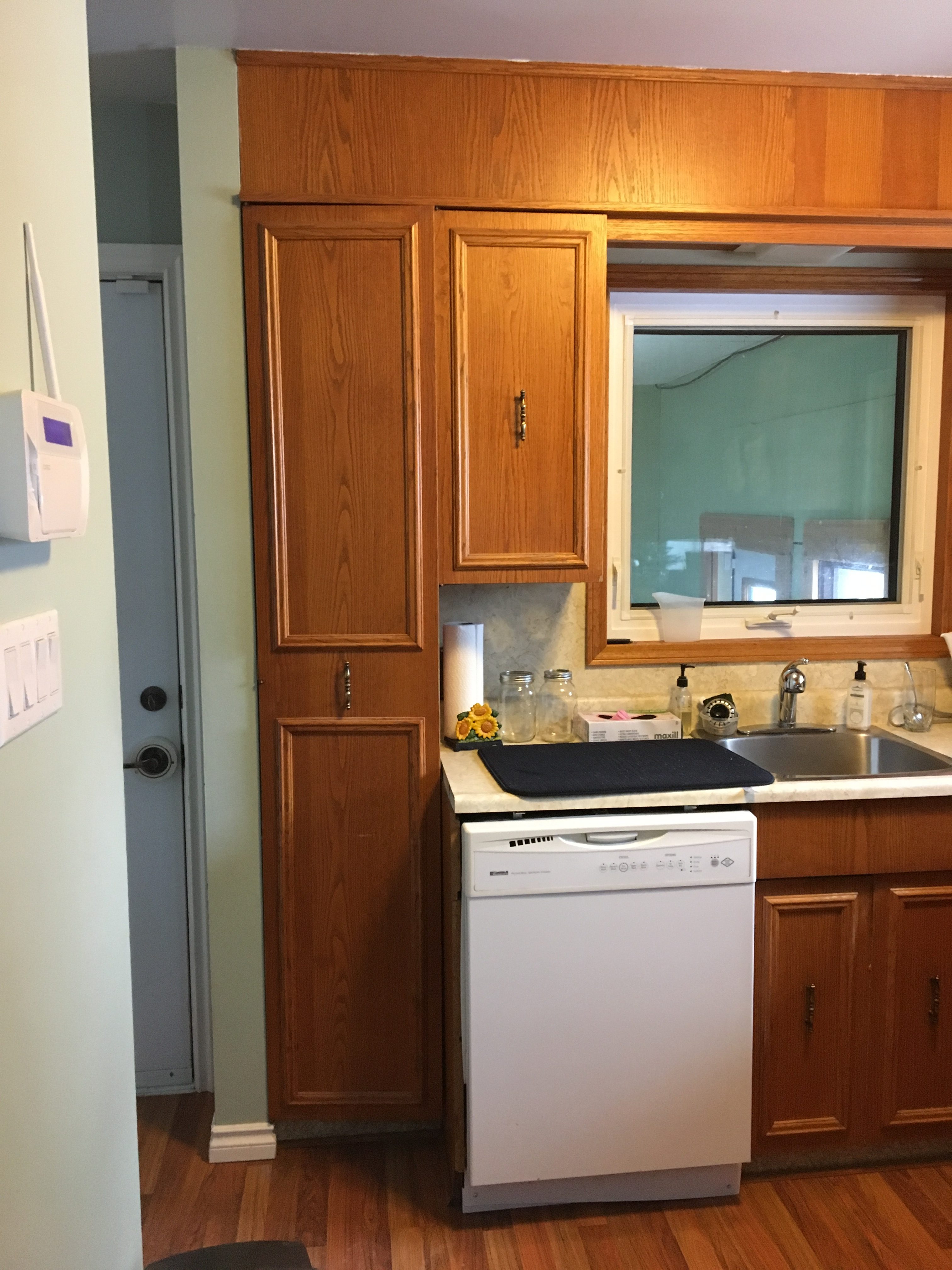
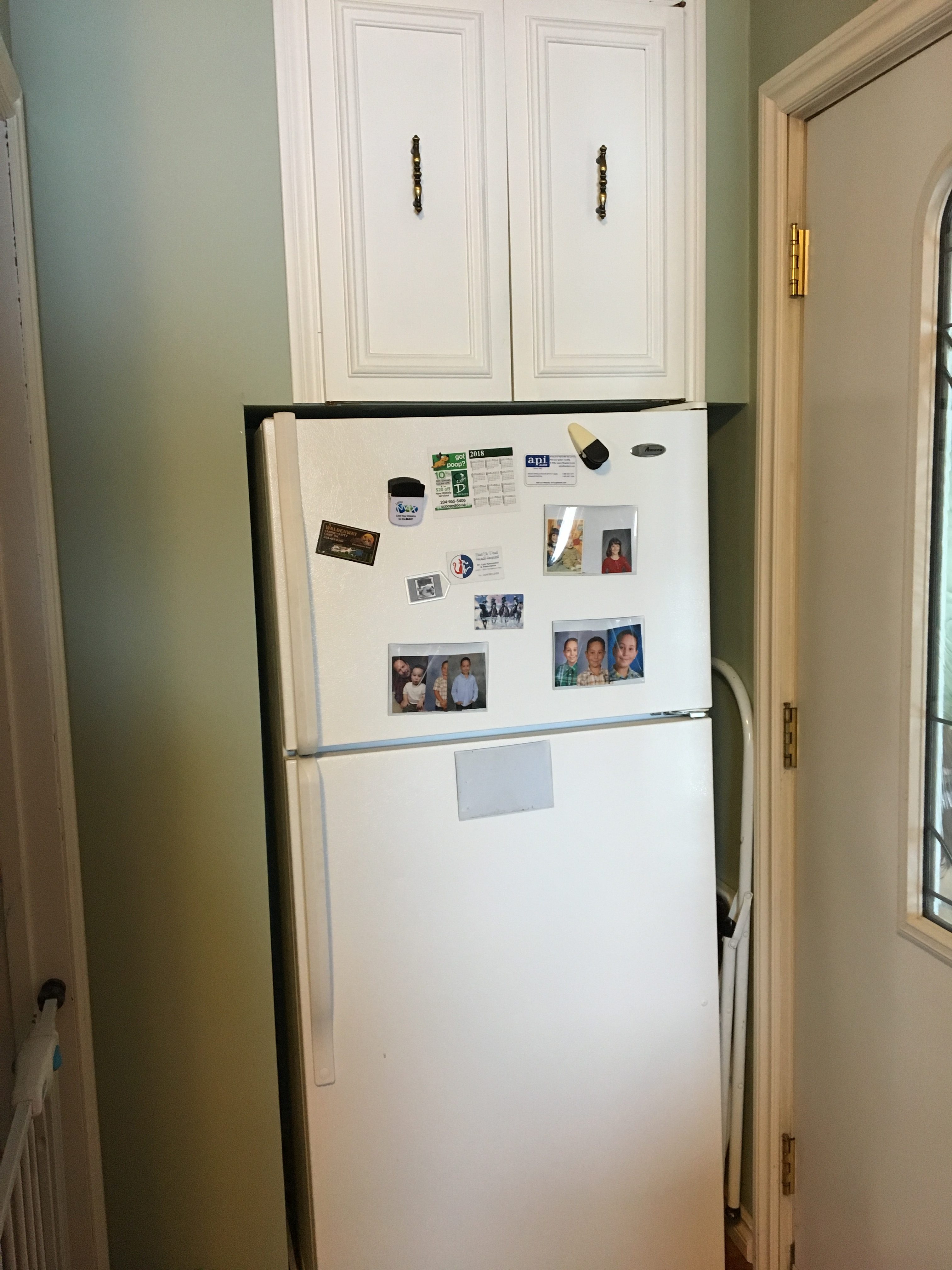
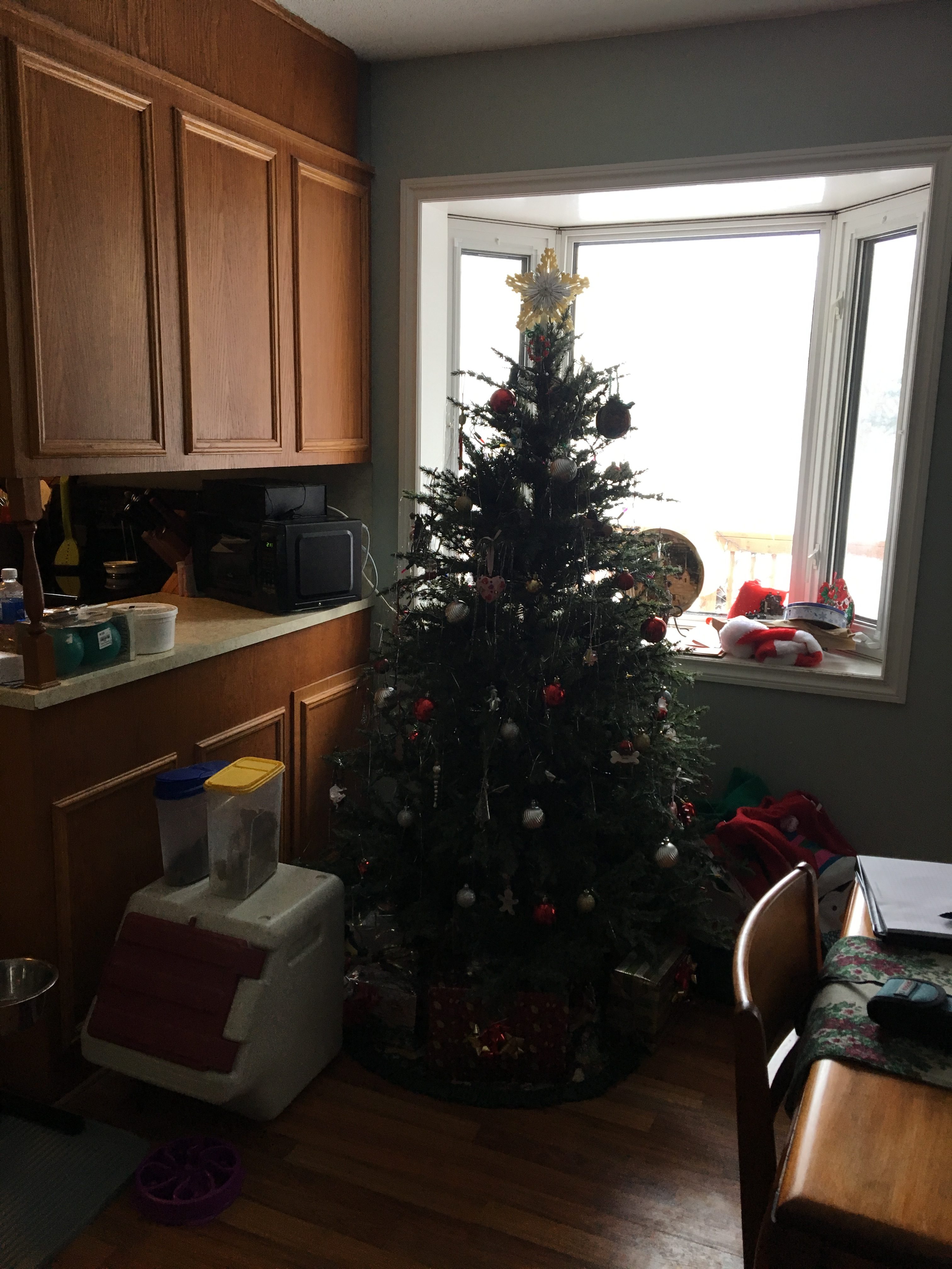
This kitchen needed additional storage and a better work flow. The dishwasher was placed at an awkward location right at the entry to the kitchen. The fridge was located in the back entry which was very inconvenient. There were 2 windows one of which wasn't letting in any natural light.
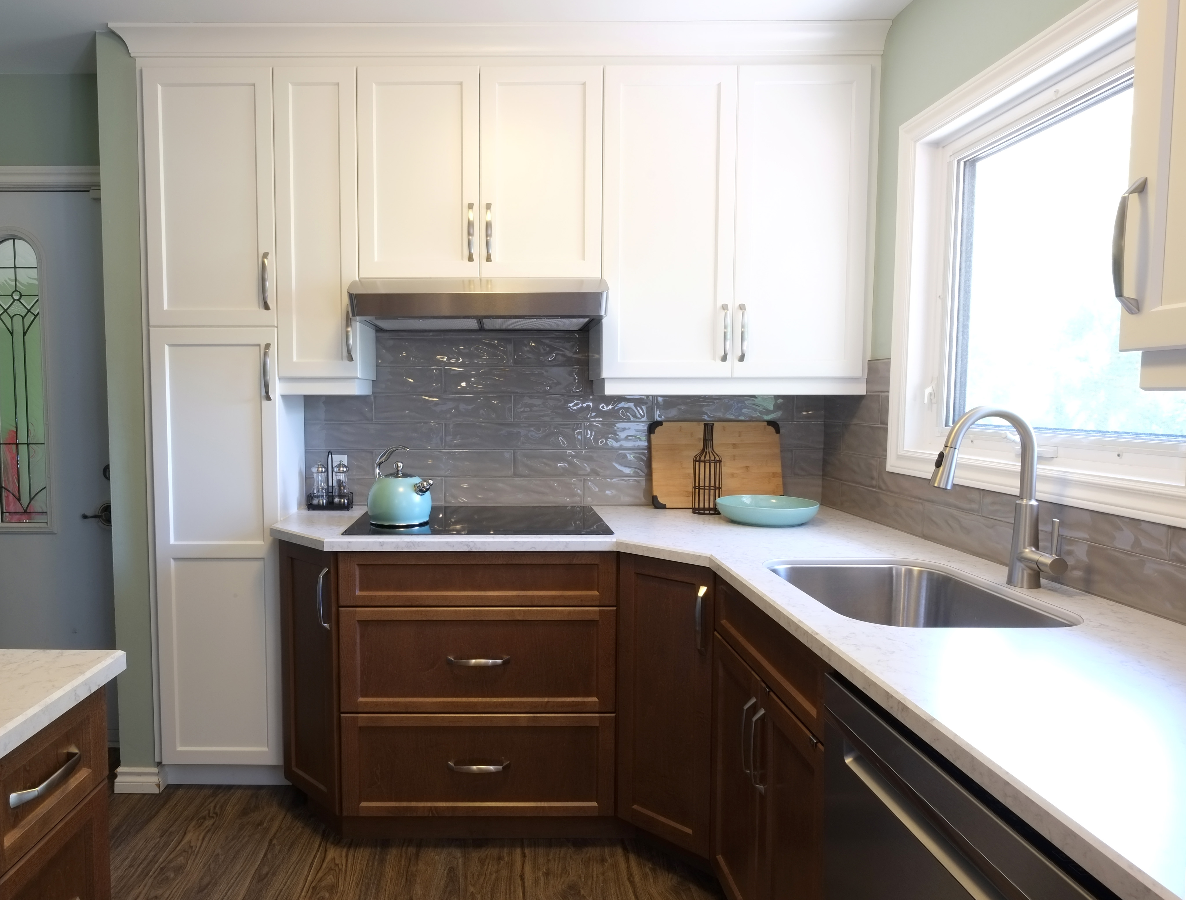
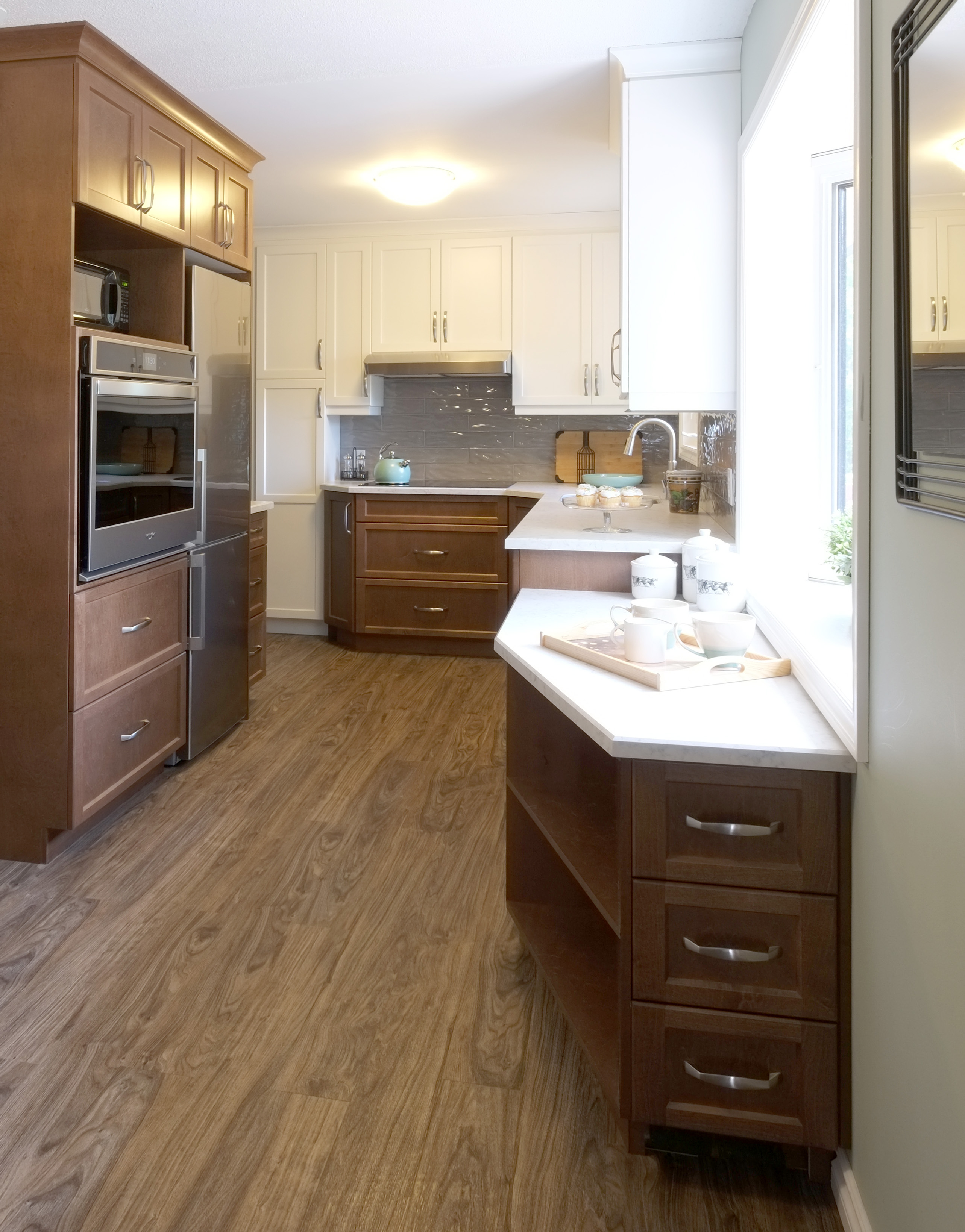
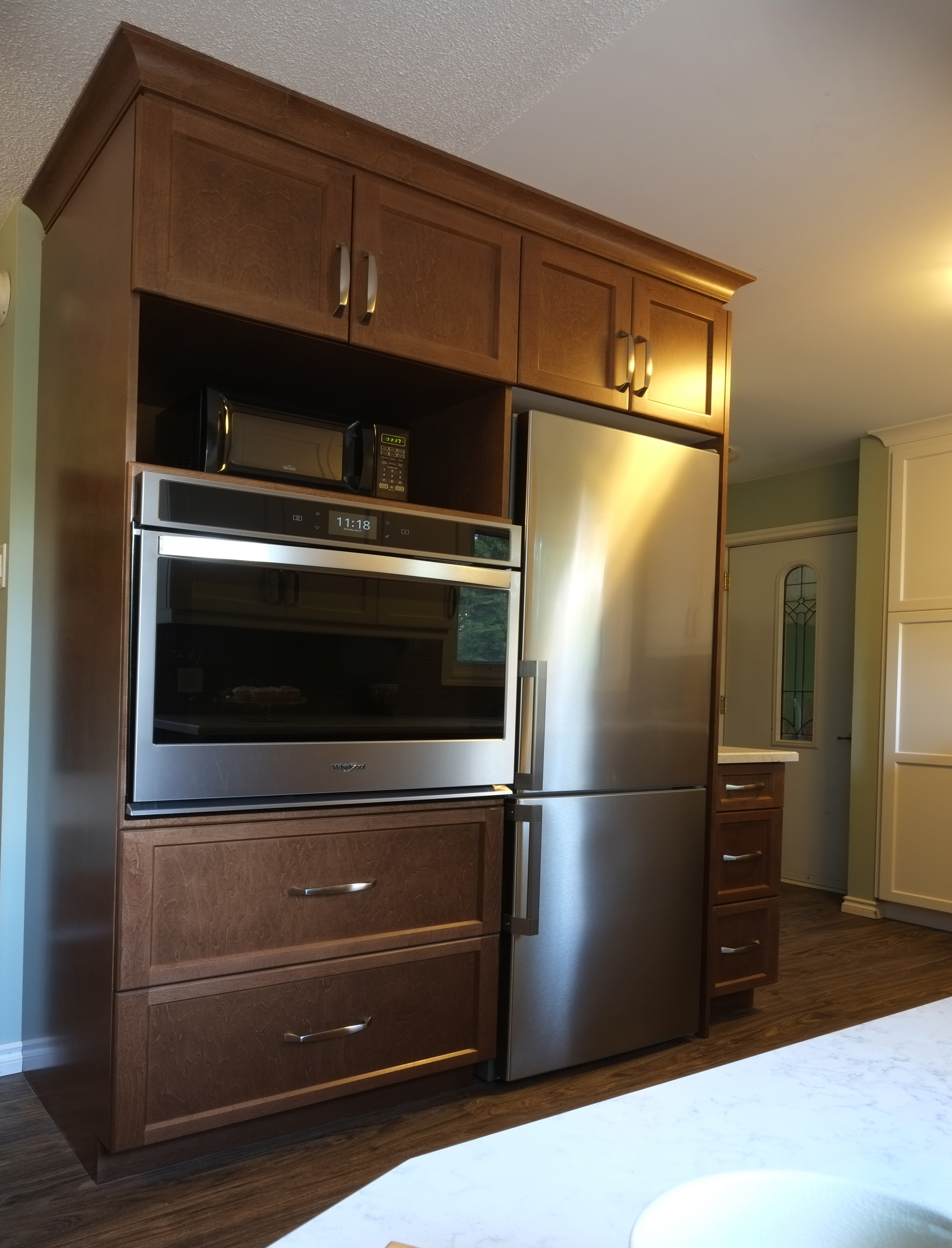
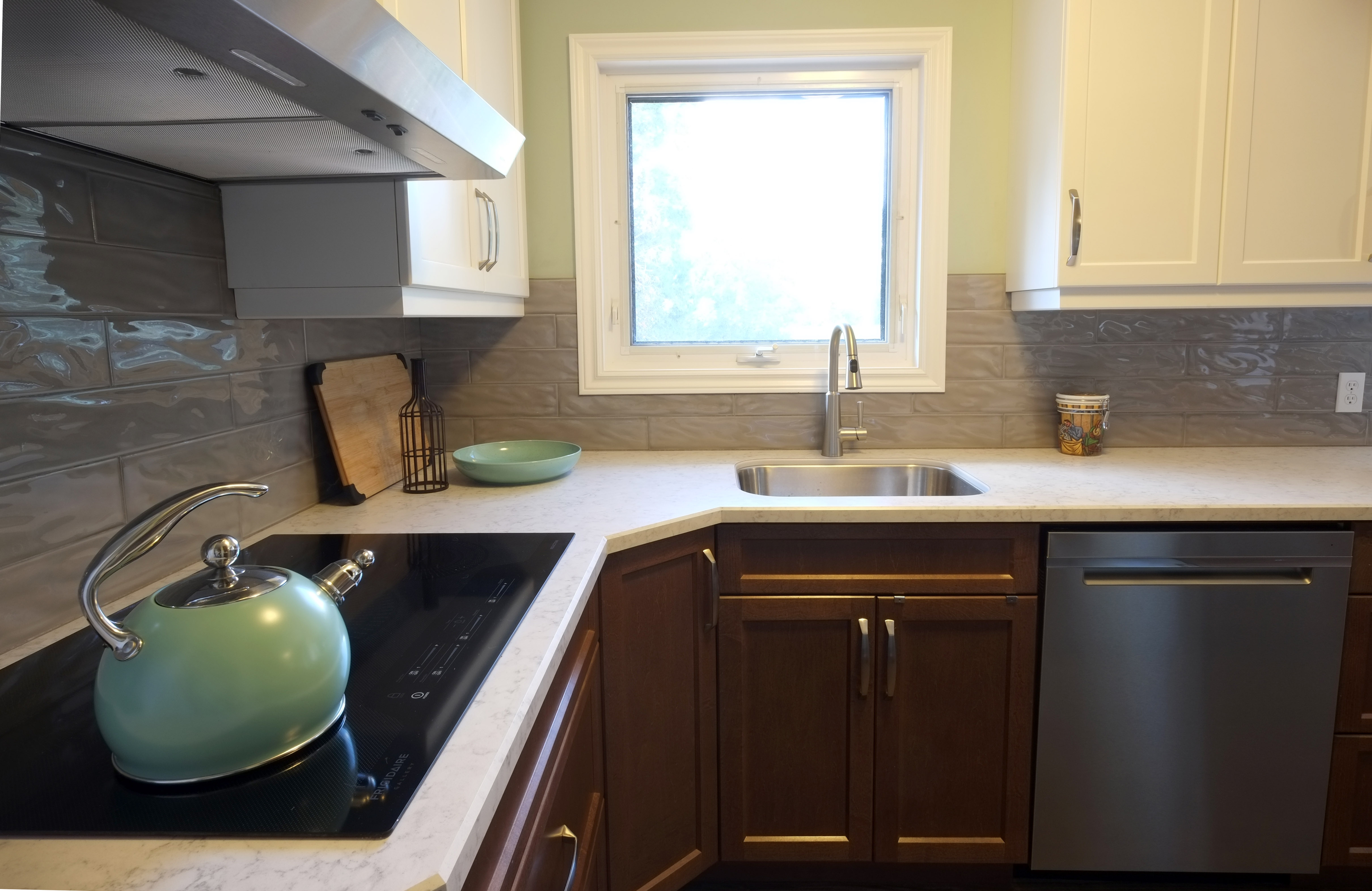
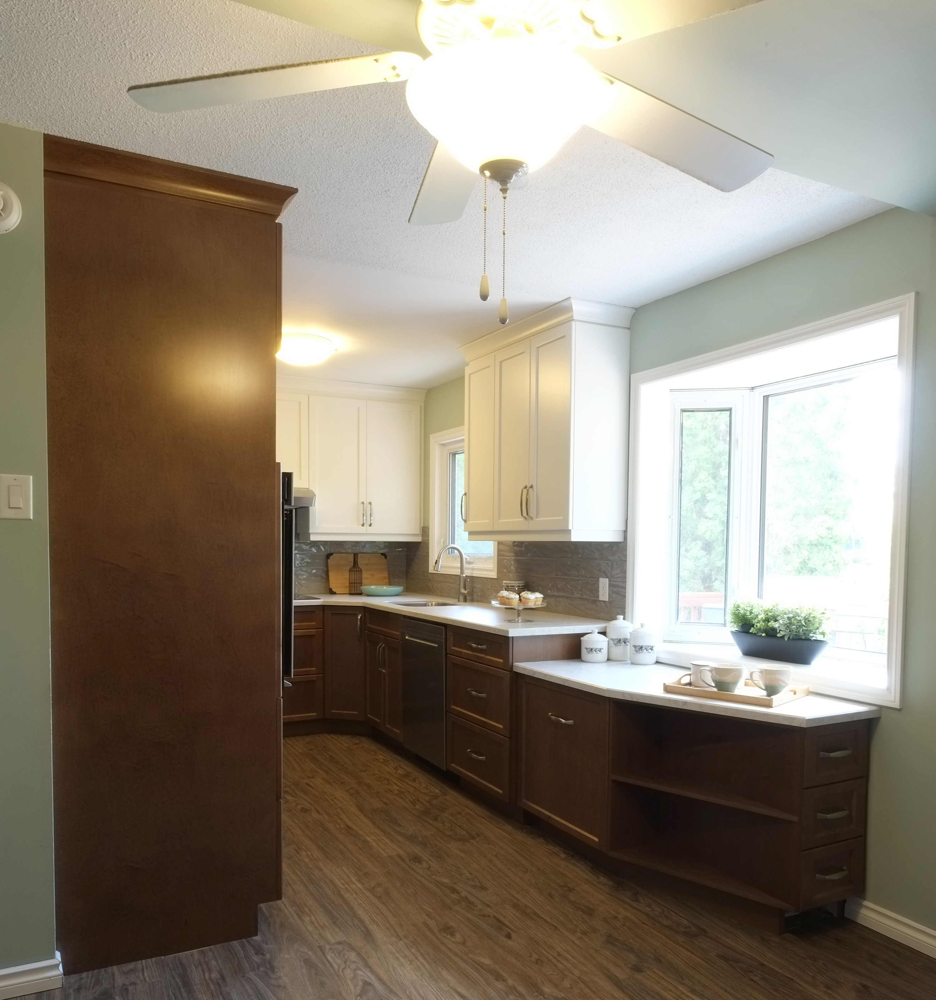
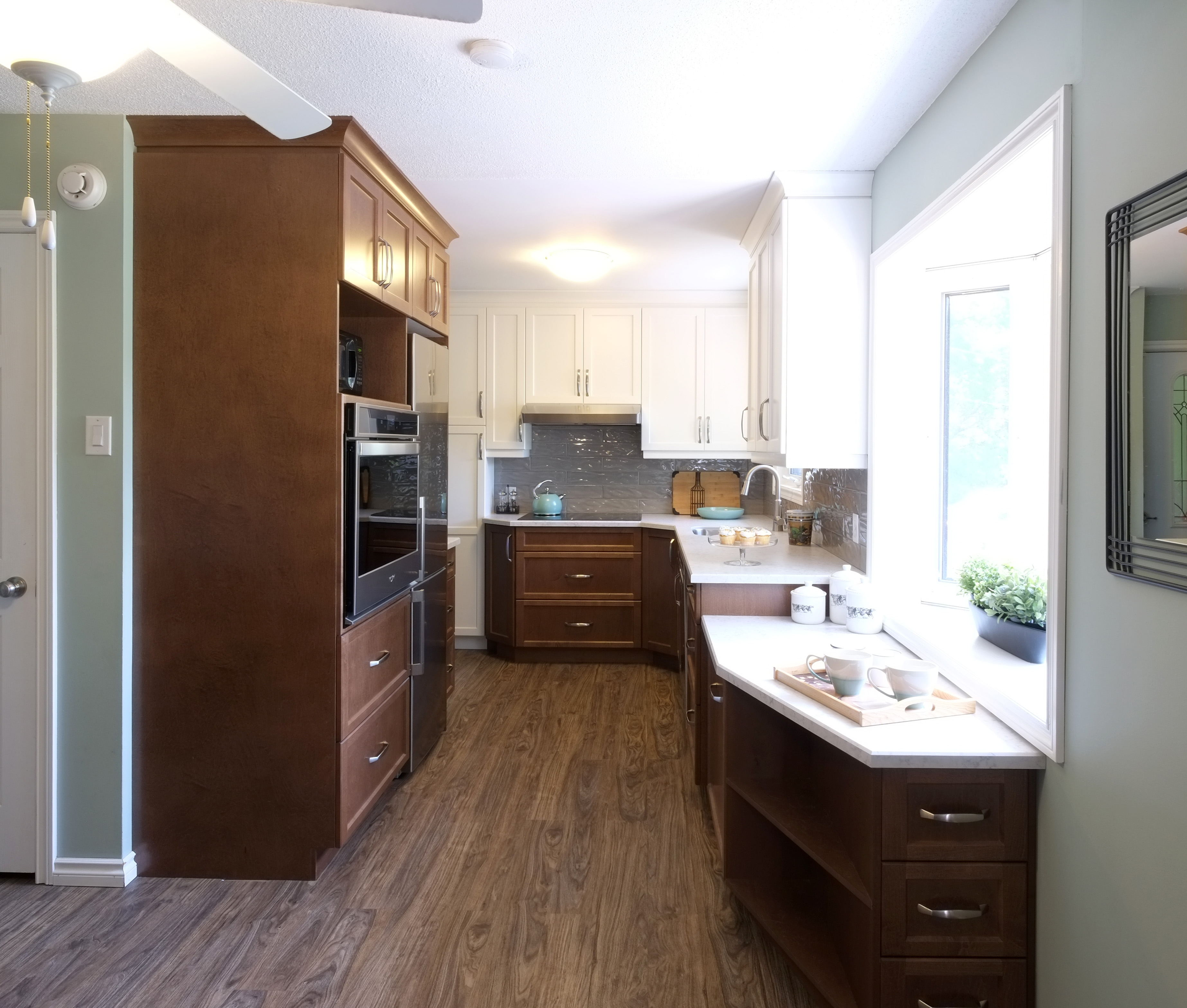
We opted for a galley style kitchen which allowed us to bring in an appliance wall with built in oven, the microwave and fridge. We relocated the dishwasher to the window wall and moved the cooktop to the area where the sink use to be. The window was closed off and the sink was moved to below the remaining window. We added additional counters and storage to the area below the bow window. This provide an abundance of storage space and a nice place to grow herbs if so desired.

